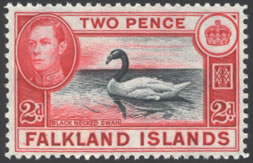
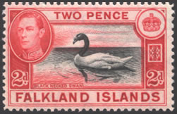
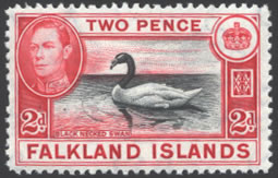
Falkland Islands
Updated September, 2010
The first Falkland Islands King George VI set was printed by Bradbury Wilkinson, and was issued from 1937 through 1949. Most of the issues were printed four times. Each of these printings has visible traits that may help you identify your stamps. This article attempts describe these characteristics for King George VI collectors.
Before we get into to sorting stamps, let me
tell you my methodology. I collect KGVI stamps based on printings. I try
to accumulate as many copies as possible, and compare them to notice their
various features. There are certain factors that I use to make these comparisons:
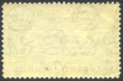
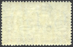
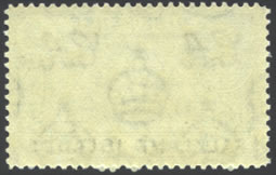
· 1) The look of the paper and gum as seen from the back of the
stamps against black and later white laser printer paper under twin spotlights
using 75 watt soft white bulbs. There are noticeable differences due to
the changes in materials used during this time period.
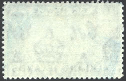
· 2) The relative thickness of the paper against black paper using the same lighting conditions This helps me see the characteristics of the watermark, and how thin or thick the paper appears based on the amount of black color that shows through the stamp. Early issues were printed on what appears to be thicker paper compared to the thinner paper used during the Second World War when shortages forced modifications to the paper that was allocated for stamp production.
· 3) The appearance of the color of the stamp when viewed against white, and later black paper under the same lighting conditions. The colors are affected by the lighting, but are at least consistent. I use the Stanley Gibbons colour key for some assistance. This is the most unreliable measurement of the three, and it is typically used after the others are evaluated.
The Falkland Islands set at first glance appears to consist of stamps
that for the most part are fairly similar. Many of the printings do not
differ that much in terms of color. In fact, with the exception of the
1/ and a few other issues, I find that the most telling trait is the appearance
of the paper and gum characteristics. These traits seem to be fairly constant,
and can be identified fairly easily once they are properly identified.
Before we begin with the identification process, let me give you a composite
of the issues, as I have found them. My information comes from several
sources: Potter & Shelton's "The Printings of King George VI
Colonial Stamps" which was published in 1952; "The Falkland
Islands and Dependencies" by Stefan Heijtz; "The 2008 editions
of the Commonwealth K.G.V.I. Catalogue" (CW #); Scott (ST #) and
Stanley Gibbons (SG #) Catalogs. The chart below shows the various printings
as described by Potter & Shelton. The printing dates are primarily
quoted from Mr. Heijtz. A few are from Potter & Shelton, and are marked
with an *. The quantities printed are quoted from Mr. Heijtz's book. The
catalog numbers used are to help you identify your stamps based on the
catalog you choose to use as a resource, and to help you find these stamps
through the various dealers who provide them. If a catalog does not list
the specific printing, the number is shown with the suffix "v"
to indication that there is variation in the printings that may be found
under that listing.
|
|
|
|
|
|
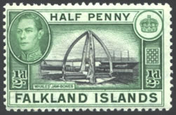
| 1/2d Black & Yellow-Green |
|
|
|
|
|
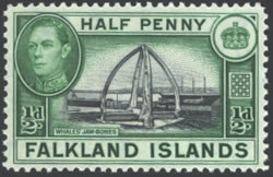
| 1/2d Black & Green |
|
|
|
|
|
| 1/2d Black & Brighter Green |
|
|
|
|
|
| 1/2d Black & Blue-Green |
|
|
|
|
|
| 1d Black & Carmine |
|
|
|
|
|
| 1d Black & Scarlet-Red |
|
|
|
|
|
| 1d Black & Scarlet |
|
|
|
|
|
| 1d Brown-Black & Violet |
|
|
|
|
|
| 1d Black & Deeper Violet |
|
|
|
|
|
| 1d Black & Violet |
|
|
|
|
|
| 1d Grey-Black & Violet |
|
|
|
|
|
| 2d Black & Violet |
|
|
|
|
|
| 2d Grey-Black & Dull Violet |
|
|
|
|
|
| 2d Black & Scarlet |
|
|
|
|
|
| 2d Black & Carmine-Red |
|
|
|
|
|
| 2d Black & Carmine-Red |
|
|
|
|
|
| 2d Black & Carmine-Red |
|
|
|
|
|
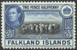
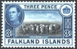
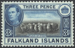
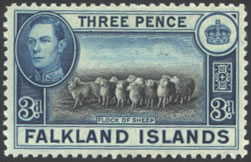
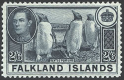
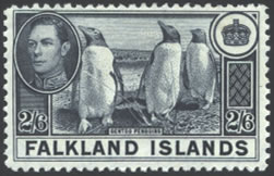
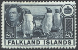
| 2-1/2d Slate & Ultramarine - Flock of Sheep |
|
|
|
|
|
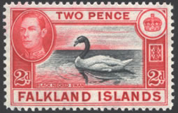
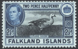
| 2-1/2d Black & Blue - Upland Goose |
|
|
|
|
|
| 3d Grey-Black & Blue |
|
|
|
|
|
| 3d Brown-Black & Blue |
|
|
|
|
|
| 3d Slate & Deeper Blue |
|
|
|
|
|
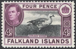
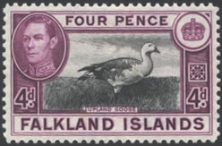
| 4d Grey-Black & Deep Reddish-Purple |
|
|
|
|
|
| 4d Black & Reddish-Purple |
|
|
|
|
|
| 4d Black & Reddish-Purple - P&S Error Not Actually Printed |
|
|
|
|
|
| 4d Black & Purple |
|
|
|
|
|
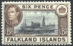
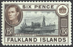
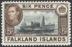
| 6d Grey & Sepia |
|
|
|
|
|
| 6d Black & Deep Sepia |
|
|
|
|
|
| 6d Black & Sepia |
|
|
|
|
|
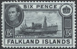
| 6d Black |
|
|
|
|
|
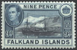
| 9d Grey-Black & Grey-Blue |
|
|
|
|
|
| 9d Sepia-Black & Deep Dull Blue |
|
|
|
|
|
| 9d Brown-Black & Grey-Blue on Tinted Paper |
|
|
|
|
|
| 9d Brown-Black & Grey-Blue |
|
|
|
|
|
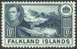
| 1/ Pale Blue |
|
|
|
|
|
| 1/ Dull Greenish-Blue |
|
|
|
|
|
| 1/ Dull Blue |
|
|
|
|
|
| 1/ Deeper Dull Blue |
|
|
|
|
|
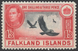
| 1/3 Black & Carmine-Red |
|
|
|
|
|
| 1/3 Black & Carmine - P&S Error Not Actually Printed |
|
|
|
|
|
| 2/6 Slate |
|
|
|
|
|
| 2/6 Slate |
|
|
|
|
|
| 2/6 Slate |
|
|
|
|
|
| 2/6 Bluish-Slate |
|
|
|
|
|
| 5/ Bright Blue & Chestnut |
|
|
|
|
|
| 5/ Indigo & Pale Yellow-Brown |
|
|
|
|
|
| 5/ Bright Blue & Yellow-Brown |
|
|
|
|
|
| 5/ Bright Blue & Bistre-Brown |
|
|
|
|
|
| 10/ Black & Deep Orange |
|
|
|
|
|
| 10/ Black & Orange |
|
|
|
|
|
| 10/ Black & Orange |
|
|
|
|
|
| 10/ Black & Red-Orange |
|
|
|
|
|
| £1 Grey-Black & Violet |
|
|
|
|
|
| £1 Black & Violet |
|
|
|
|
|
| £1 Black & Deeper Violet |
|
|
|
|
|
| £1 Black & Deep Violet |
|
|
|
|
|
Although Potter & Shelton list a 1941 4d and a 1948-50 Colonial Release of the 1/3d, I have been advised by noted Falkland Island specialist Tony Belfield that these are not correct. These stamps were not printed. The dates were left in the chart in order to correlate to the original listing by Potter & Shelton.
I will admit that there are probably other discrepancies in this chart. If you note any errors, additional information would be appreciated. This article is posted on the Internet to invite collaboration. Here are a few differences I have noted: The 2d violet issues as described by Potter & Shelton differ from all other sources. I feel the other sources are correct in this case, and reassigned them accordingly. Where print quantities are not listed the issue was not included in Mr.Heijtz's book, I assume they are part of another total shown, but cannot be determined due to other circumstances. This is not that unusual for King George VI issues. Remember, that World War II was occurring during this time period. Stamp issue records did not survive for other Colonial issues.
Assuming that you take a little time to look over the table; you should note that there were four primary printing dates: 1937, 1938, 1944, and 1949. These dates were used for most of the issues. I would like to describe these issues first.
One of my theories in studying stamp printings, is that stamps that were printed at the same time are very likely to have similar paper, gum, and color. This theory was originally proposed to me by my friend Larry Goldberg, the former editor of George VI. Larry (who is in the advertising business) suggested to me that a printer makes a print run as efficiently as possible. The ink is measured and mixed to meet the required print run; and is used as soon as possible to avoid waste. The paper would also be allocated from some type of bundle, and would be typically used sequentially. In this type of circumstance, the gum would likely be applied in one process also. Naturally, there are known exceptions to this theory; but if you take a close look at the paper and gum characteristics of the Falkland Islands issues, they do seem to follow a recognizable pattern. This pattern is what I use to sort the printings.
Okay, so if you agree with Larry's theory about stamp production, how do you figure out the characteristics of the various printings? Luckily for this issue, there were some changes in color and design that can help isolate specific printings which can be used as reference copies. These issues are primarily used to make the assumptions that I have made about identifying the Falkland Islands printings. The list is shown below:
|
|
|
|
|
|
Slate & Ultramarine - Flock of Sheep Design |
|
|
|
Grey-Black & Dull Violet |
|
|
|
Brown-Black & Grey-Blue on Tinted Paper |
|
|
|
Black |
 |
 |
 |
 |
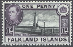
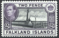
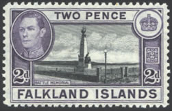
1937 Printing Look for Off-White Color and Crackly Gum |
1938 Printing Look for Whiter Color and a Wavy Look to the Gum |
1944 Printing Look for Off-White Color and Flat Gum |
1949 Printing |
1937 Issues:
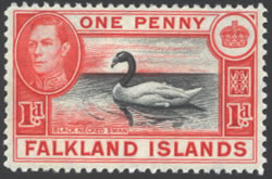
Let's start with the 1937 printings. Normally, the first printings are among the more elusive issues for a King George VI set. Bermuda is a good example, where a set of the first printing keyplates would sell for over $1,000 U.S. In the case of the Falkland Islands, there is no current premium for stamps of this era. In fact, many of the later printings are more valuable. The 1937 printings are fairly easy to identify. In fact, if you have just purchased only one set of this issue, you have a reference copy of the 1937 printing: It is the 2-1/2d Flock of Sheep issue. This stamp was printed only once, in 1937. If you look at the back of this stamp against black paper, you should notice that the gum is not very smooth. In fact, there are typically visible cracks in the gum. The watermark is fairly visible without enhancement, assuming your vision is properly corrected. Comparing the back of the stamp against white paper, the color tends to be more yellowish-white than the white of laser printer paper. In the case of the 2-1/2d issues, there is no reason to compare the color of the stamp, but we will do this for other issues.
In summary, the 1937 issues can be found by looking for the gum cracks, and the yellowish paper. I will admit to you that I have found some 2-1/2d issues without these cracks, so this method is not fool-proof. It is, however, the one that I typically use to evaluate my printings.
1938 Issues:
Isolating a 1938 issue for comparison will take a little more effort on your part. I use the 2d Black and Violet issues for this purpose. Unfortunately, there were two printings, so before we can allocate a reference piece, we have to figure out how to identify the printings. Luckily, the two printings vary, and can be fairly easily differentiated based on the color of the stamps. Looking at the chart, you should note that the descriptions according to the chart are as follows:
1937 Printing: 2d Black & Violet
1938 Printing: 2d Grey-Black & Dull Violet
Ironically, Potter & Shelton have these two printings reversed, but all of the other sources show the Dull Violet shade as a 1938 printing. Based on the crackly gum characteristics of the Black & Violet issue, I agree with the other sources. The primary visible color difference between the two printings is the dull violet color of the 1938 printing. If you have multiple copies, look at them all against black paper, and concentrate only on the violet frame. Assuming that you have enough copies to have both printings, you should note two distinctly different colors. One is deeper and more pronounced than the other which is dull and less pronounced. Do you see it?
The deeper more pronounced color should be the 1937 printing. Flip it over, and look at the gum. Is it cracked? If so, you have found the 1937 issue. The duller colored issue should be the 1938 issue. That is the one we will study for reference.
The bad news about identifying the 1938 issues is this: They differ from one another more than the 1937 printings. As a result, you will not always be identify a stamp that was printed in 1938 by the method I am about to describe. Please let me know if you find other variations. I will publish them as addenda to this article.
Looking at the Dull Violet issue, flip over all of the copies you have found. (I hope there is more than one, or this may not work.) Comparing the backs against black paper, you should note that some of the stamps do not appear to be very flat looking. In fact, on some of my copies, I have noticed a wrinkled look to the gum (not the paper) that runs vertically up the stamp. This effect reminds me of a stretched cotton shirt just before it is ironed. The shirt looks flat, but these little wrinkles appear. This is the characteristic I have seen on some of the 1938 printings. Unfortunately, not all of them. You should be able to see this effect better if you look at the stamp from a 45 degree angle with the light source at a 45 degree angle behind the stamp. For the record, the gum and paper will look yellowish compared to the white laser paper on this issue, but are not as yellowish as the 1937 printing. You should also know that I have seen some slight gum cracking on a few of the 1938 printings, but it is not as pronounced as the 1937 issues. So be careful to compare the color after you have looked at the gum and paper.
1944 Issues:
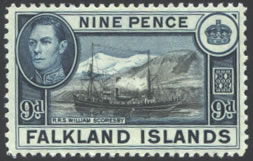
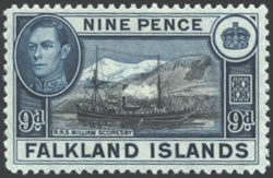
The 1944 issues differ significantly from the earlier issues we described. If you are lucky enough to find a 9d issue on tinted paper, the comparison will be fairly easy. Looking at the back of the stamp, you should notice that the gum is perfectly flat. Where you noted cracks and a wavy appearance to the gum for the 1937 and 1938 printings; the 1944 printings have no texture at all. Compare the back of the stamp against a piece of white laser paper. You should note that the color is still yellowish-white, but not as yellowish as the 1937 printing.
If you are unable to find a tinted paper 9d issue, you should still try to compare your stamps to find this printing. It is fairly common particularly among the four high values of the set.
2/1949 Issues:
I guarantee that if you have a complete set with the 6d Black, you can find this printing. You see, the 6d black was not reprinted. Take a moment to compare it to the other printings we have isolated. You should note that the gum is similar to the 1944 printing in that it is flat with no variation. If your lighting is good, you should also notice that the gum and paper appears whiter than all of the other printings; and that the paper appears just a little thinner. This thinner paper trait is not a measurement, just an impression based on the way the design shows through from the front when compared against black paper.
Although you do not need to know the characteristics of the 2/1949 printing to find the 6d black, or the 2-1/2d Goose issue, it will help you isolate the 7/1949 printings. They are very similar to this printing.
7/1949 Printings:
The 4 high values of the Falkland Islands "thin paper issues" sell for a fairly good premium over the other issues. The 7/1949 printings are the "thin paper issues", so there is an incentive to find these issues. For what it is worth, I would characterize these issues as the "white paper issues", but that is my opinion.
The most obvious trait is the white paper. It is similar to the 2/1949 issues, and can be easily seen against black paper. I use the 6d black for comparison. Although there are some differences, these issues are closer to the 6d black than any other printing.
For the record, the 7/1949 printings do seem scarce to me. I have not found that many. If you look at the numbers printed, you may get the impression that these were printed in about the same quantity as the other issues. However, there is one piece of information missing from the chart. There were issues destroyed when this set of stamps was replaced with the new printing in 1952. These destroyed issues would primarily be from the 1949 printing since they would be the ones still sitting unsold at the local Post Office. Quoting from Mr. Heijtz again, here are the quantities destroyed:
|
|
|
|
|
|
|
|
|
|
|
| 2-1/2d |
|
|
|
|
|
|
|
|
|
|
|
|
|
|
|
|
|
|
|
|
|
|
|
|
|
|
|
|
|
|
|
The Remaining Printings - 1941, 1942, and 1947:
These printings comprised several of the low value issues. Unfortunately, they are more difficult to isolate by paper and gum. From the stamps that I have examined, it appears that the 1941 and 1942 issues seem to be close to the 1944 printings with the flat gum appearance and the 1947 issues were on a whiter paper and gum than the 1944 issues, in fact they tend to be close to the appearance of the 1949 issues. I used color differences viewed against both black and white paper, and my best guess after looking at multiple copies of each value.
How I Sorted Each Value:
As a summary, I thought it might help to describe how I sorted each value to further explain my thought process. Please remember, this does not work with two stamps. I accumulated as many copies as possible prior to making the comparisons and laid out each value on a sheet of paper to make these comparisons. I tend to look first at the paper and gum, and then the colors as described by Potter & Shelton in making my decisions. Please treat these scans as approximations of the stamps. They are low resolution so this article will load at a reasonable rate of speed, but not an exact copy of the actual colors. There is no foolproof way to compare colors over the net. However, in most cases, the relative differences can be seen. Here is my description of the process for each value, and remember, I am describing subtle differences.
1/2d Values |
|||
 |
 |
 |
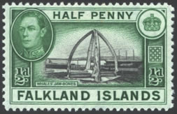 |
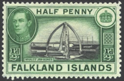
1937 Printing 1/2d Black & Yellow-Green |
1942 Printing 1/2d Black & Green |
1944 Printing 1/2d Black & Brighter Green |
1947 Printing 1/2d Black & Blue-Green |
| Comparing the colors, you should notice subtle shades
of Green, Yellow-Green and Blue-Green. The 1937 Yellow-Green issue
should have cracked gum, although I did find some with cracked gum
that were just Green. The Bluish-Green issue has a little whiter
gum and paper, but not as white as the 1949 printings. You will
also note many shades that are not Yellow-Green or Blue-Green. These
are the 1942 or 1944 Printings. I compared the gum, and color of
these issues. The brighter green according to Potter & Shelton
should be the 1944 printing which should also be on the more off-white
paper. This would make the Green issue the 1942 printing. When I sorted my stamps, the 1937 issue seemed to be the most common, and the 1944 and 1947 the most scarce. Although none are truly rare. |
|||
| 1d Values | ||||||||||
|
||||||||||
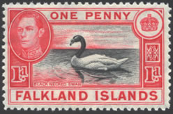
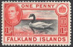
| The primary variation is in the red color. All of my copies have cracked gum in varying intensities. The two primary colors as listed by each of the catalogs is: Carmine and Scarlet. Potter & Shelton add a Scarlet-Red shade. I sorted these by color only. The carmine issues tend to be redder than the scarlet issues which seem to have a little more orange. After you have isolated the scarlet issues, you may notice there are two shades of the scarlet. The issue with a little more red to it, should be the 1937 printing Potter & Shelton describe as Scarlet-Red. The other one would then be the 1939-40 Scarlet issue. | ||||||||||
1d Values |
|||
 |
 |
 |
 |
| 1941 Printing |
1942 Printing 1d Black & Deeper Violet |
1944 Printing 1d Black & Violet |
1947 Printing 1d Grey-Black & Violet |
| Most of the violet 1d issues are very similar. I did find one copy with a brownish-black center which I assume to be the 1941 printing, and a shade on whiter paper that should be the 1947 printing. The remaining issues would be from the 1942 or 1944 printings. Potter & Shelton indicate that the 1942 printing is deeper colored than the 1944 printing. This appears to be true. The one I assigned to the 1942 printing had gum that was a little thicker looking with more texture than the flat off-white colored gum of the 1944 printing. | |||
2d Values |
|||
 |
 |
||
1937 Printing 2d Black & Violet |
1938 Printing 1d Grey-Black & Dull Violet |
||
| The 2d violet issues were differ in the characteristics of color and the gum & paper. Look for the crackly gum of the 1937 issue compared to the frequently found wavy gum of the 1938 issue. You should also note the difference in the intensity of the violet color. The 1937 printing will be the deeper colored issue. The 1938 issue is the pale violet shade. | |||
2d Values |
|||
 |
 |
 |
 |
1941 Printing 2d Black & Scarlet |
1942 Printing 2d Black & Carmine-Red |
1944 Printing 2d Black & Carmine-Red |
1949 Printing 2d Black & Carmine-Red |
| The 2d red issues differ a little in terms of color variation, and to some extent based on the gum and paper conditions. The 1941 printing is a scarlet color compared to the carmine-red shades of the later printings. Unfortunately, it is not as pronounced as the difference between the scarlet and carmine of the 1d issues. The three remaining printings are in shades of carmine. The 1949 issue has a deeper color, and whiter gum and paper like the other versions of this printing, so it can be found by looking for the white paper. Use the 6d black for comparison. The 1942 and 1944 printings are a little more difficult to identify, but it is likely you have them. They are the most common. Compare the gum and paper with other 1944 values you have identified to isolate the 1944 printing. If you have stamps that are slightly different from the 1944 issues on thinner appearing paper, they are probably from the 1942 printing. The color of the 1942 issue seems to be slightly deeper than that of the 1944 printing, and the paper and gum seem to be shinier than the flat off-white gum of the 1944 printing. | |||
2-1/2d Values |
|||
|
|
||
1937 Printing 2-1/2d Slate & Ultramarine |
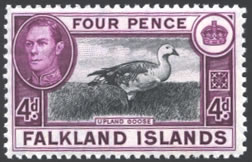
1949 Printing 2-1/2d Black& Blue |
||
There was only one printing from each of these issues, so you should have no problem identifying them. Notice the crackly gum on the 1937 (sheep) printing, and the
white gum on the 1949 (goose) issue. |
|||
3d Values |
||||
 |
 |
 |
||
1941 Printing 3d Grey-Black & Blue |
1942 Printing 3d Brown-Black & Blue |
1944 Printing 3d Slate & Deeper Blue |
||
| This is the one that I found to be the most difficult. The two 1941 and 1942 printings seem to be the ones that are not dark blue (the 1944 printing). I felt that the center of the 1942 printing was lighter than the 1941 printing (brown-black compared to grey-black). For the record, the center of the 1944 printing (deep blue frame) seemed to be very close to the one that I feel is the 1941 printing. Potter & Shelton differ in the color descriptions from every one else here by indicating that the 1944 printing is the only deep blue printing. I think I agree with Potter & Shelton, but can not put up much of an argument either way. | ||||
4d Values |
||||
 |
 |
 |
||
1937 Printing 4d Grey-Black & Deep Reddish-Purple |
1938 Printing 4d Black & Reddish-Purple |
1944 Printing 4d Black & Purple |
||
| I sorted these issues by gum and paper into three piles: the 1937 issues with crackly gum, the 1938 issues with the wavy looking gum, and the 1944 issues which had the flatter looking gum on off-white paper. In addition to the state of the gum, the differences in the red-purple color will also help you isolate the various issues. | ||||
6d Values |
|||
 |
 |
 |
 |
1937 Printing 6d Grey & Sepia |
1938 Printing 6d Black & Deep Sepia |
1944 Printing 6d Black & Sepia |
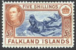
1949 Printing 6d Black |
| This was the easiest printing. I sorted the stamps by
gum and paper. The 1937 issues have the crackly gum, the 1938 issues
(which are the deep brown color) have the wavy gum and paper, and
the 1944 issues (which resemble the 1937 issues in color) have the
flat gum and paper. For the record, Commonwealth assigns two 1937
printings; but I think CW10a is actually the 1944 printing based on
the characteristics of the gum and paper. Compare your copies, and
decide. The 1949 printing is a good example of the white paper and gum that you will see on some of the other issues. So plan to use this issue to compare. |
|||
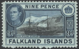
9d Values |
|||
 |
 |
 |
 |
1937 Printing 9d Grey-Black & Grey-Blue |
1938 Printing 9d Sepia-Black & Deep Dull Blue |
1944 Printing 9d Brown-Black & Grey-Blue |
1947 Printing 9d Brown-Black & Grey-Blue |
| These values will fall into the same pattern as the 6d issues, with the addition of a 1947 printing which is on white paper. The colors are very similar. The 1944 printing on tinted paper is unusual, and should be catalogued. Look for a bluish-greyish cast to the paper as you look at the front of the stamp. You will also note the flat 1944 gum on this issue. | |||
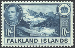
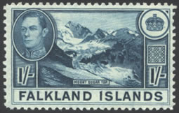
1/ Values |
|||
 |
 |
 |
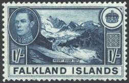 |
1937 Printing 1/ Pale Blue |
1938 Printing 1/ Dull Greenish-Blue |
1944 Printing 1/ Dull Blue |
1947 Printing 1/ Deeper Dull Blue |
| These will also fall into place by comparing the paper and gum. The 1937 printing has the crackly gum, and is rather a distinctive paler blue color compared to the rest of the issues. The 1938 printing with the wavy gum and paper; is deeper and tends be a greenish-blue compared to the 1937 issue. The remaining issues will have flatter looking gum and paper. The elusive 1947 issue has the whiter paper and gum like the 1/2d blue-green issue. It is also a deeper color of blue. The 1944 issue falls in the middle in terms of color when compared to the 1938 printing and the 1947 printing. It could be mistaken for the 1947 printing, but can be found just by comparing the gum. If you are not sure about whether you have the 1944 or 1947 printing - you have the 1944 printing. It is fairly common. | |||
1/3 Value |
|||
 |
|||
1946 Printing 1/3 Black & Carmine-Red |
|||
| There was only one printing from this issue. Although Potter & Shelton note a Colonial Release - there was not a second printing, so it could only have been from the original printing. I did see two distinctly different paper and gum combinations. One is a flatter duller color, the other is brighter which does make it look like a later printing. | |||
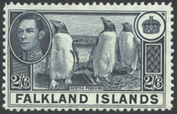
2/6 Values |
|||
 |
 |
 |
 |
1937 Printing 2/6 Slate |
1938 Printing 2/6 Slate |
1944 Printing 2/6 Slate |
1949 Printing 2/6 Bluish-Slate |
| The first three printings can be identified by gum and paper only. I did not notice any color difference between them. As I stated earlier, the 1949 printing is a bluish slate color which could be used to identify this printing even before you notice the white gum and paper. | |||
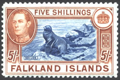
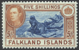
5/ Values |
|||
 |
|
 |
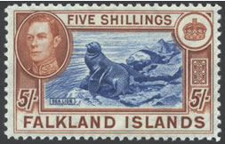 |
1937 Printing 5/ Bright Blue & Chestnut |
1938 Printing 5/ Indigo & Pale Yellow-Brown |
1944 Printing 5/ Bright Blue & Yellow-Brown |
1949 Printing 5/ Bright Blue & Bistre-Brown |
| There is good reason to check these issues for the wavy gum that was described as indicative of the 1938 printing. If you find one, it is the celebrated "Indigo" shade. However, don't be too disappointed if your copy is the 1944 printing. That is the one I always seem to find. The gum and paper will help you identify these printings. There is a slight color difference in the brown frames, but I have trouble sorting these issues by color alone. The exception is of course the indigo shade. Which I feel should be better described as the "Yellow-Brown shade', but that is less dramatic. Look for the white paper and gum on the 1949 issue. That is a scarce stamp also. | |||
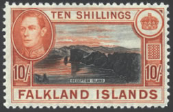
10/ Values |
|||
 |
 |
 |
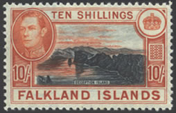 |
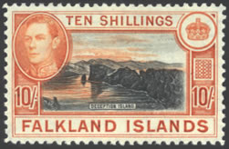
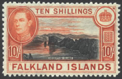
1937 Printing |
1938 Printing 10/ Black & Orange |
1944 Printing 10/ Black & Orange |
1949 Printing 10/ Black & Red-Orange |
| The paper and gum characteristics are helpful for the 10/ issues also, but there are observable color differences as well. The 1937 printing is a deep orange, the 1938 printing is much paler. The 1944 printing seems to fall between these two extremes, and the 1949 printing is just a little paler than the 1938 issue. | |||
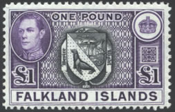
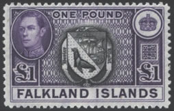
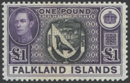
£1 Values |
|||
 |
 |
 |
 |
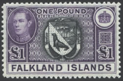
1937 Printing £1 Grey-Black & Violet |
1938 Printing £1 Black & Violet |
1944 Printing £1 Black & Deeper Violet |
1949 Printing £1 Black & Deeper Violet |
| The £1 issues require gum and paper comparisons to sort. Although there are color differences, but they are not extreme enough to describe in useful terms. The centers vary from a greyish-black to black, and the frame color goes from violet to deep violet. Potter & Shelton's descriptions seem to match my copies for this value. Sort your copies by gum and paper and then see how they match against the descriptions provided by Potter & Shelton. | |||
Conclusion
I hope this article was helpful in sorting your stamps. My goal was to put into writing all of the information that I have found, and observed about these interesting issues. This is meant to be a collaborative effort, so if you have additional information, comments, or disagree with any of the statements; please let me know. I would like this article to be a depository for all information about this issue.